What is Oasis?
Oasis is a series of pop up stands located near low income areas as well as close to college campus neighborhoods. We offer take home and make meals so you can get the expirence and the self confidence to go and do it again on your own, as well as recipies to take with you and try at home! all of them are budget friendly and healthy. Utilizing the resources you can find in your neighborhod such as fresh produce. We want to illiminate the need for fast food and over use of general store cooking. Visiting the pop up will also encourage learning your neighborhood and finding like minded people who are in the same boat as you who can share thier knowlege as well.
We aew always going to need food, there is a better way to obtain it and a better way to eat!

My name is Hunter Swalve and welcome to my thesis journey!
For my project I wanted to bring awareness and potential solutions to food deserts and food insecurity
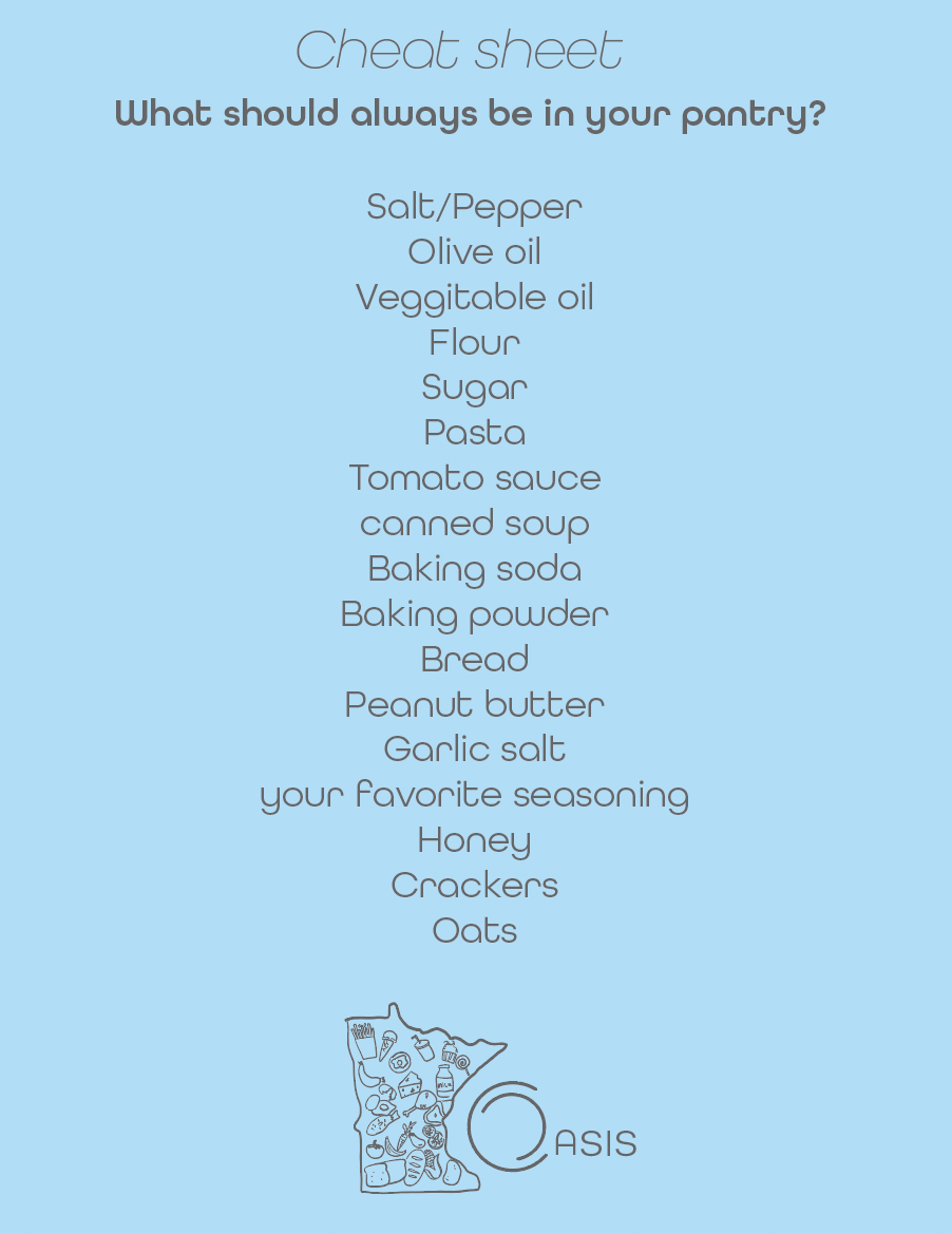
I started off by sketching the main things I wanted created for my exhibit. I knew I wanted to do a lemonade stall type of thing where you could grab all information as well as take home and make meals. At the stand I wanted; Brochures, Maps, the take and make meals, recipes, and list of essentials to keep in your pantry.

I used these companies (links provided) for inspiration on how to design my packaging and style for my designs. so this was my very rough start… to say the least haha

so this was logo number one, I was going for making the O look like a plate since my company was based around food, I also added a fork and spoon outline to help convey the plate idea
I then tried the logo with and without the fork and spoon and photoshopped it on different possibilities of how I would design my handouts. I also started with the brochure being a different color which I eventually nixed to keep a neutral color palette. At the same time keeping the logo printed on everything making it visible in all locations.


I also tried a few other typefaces which I did not find.. intriguing or visually appealing to go with round style of the plate and the theme of my project. I also looked at another type of packaging for the take and make meals. I leaned more towards this style because it would be easier to slide the meals in and out, and we then could use reusable containers to refill and wash, inspiring people to have to come back to learn more and connect with the community.


Final brochure design


Final Recipe Examples


Final packaging design


